
Architectural Process Guides
The Material Palette of a Landed Home


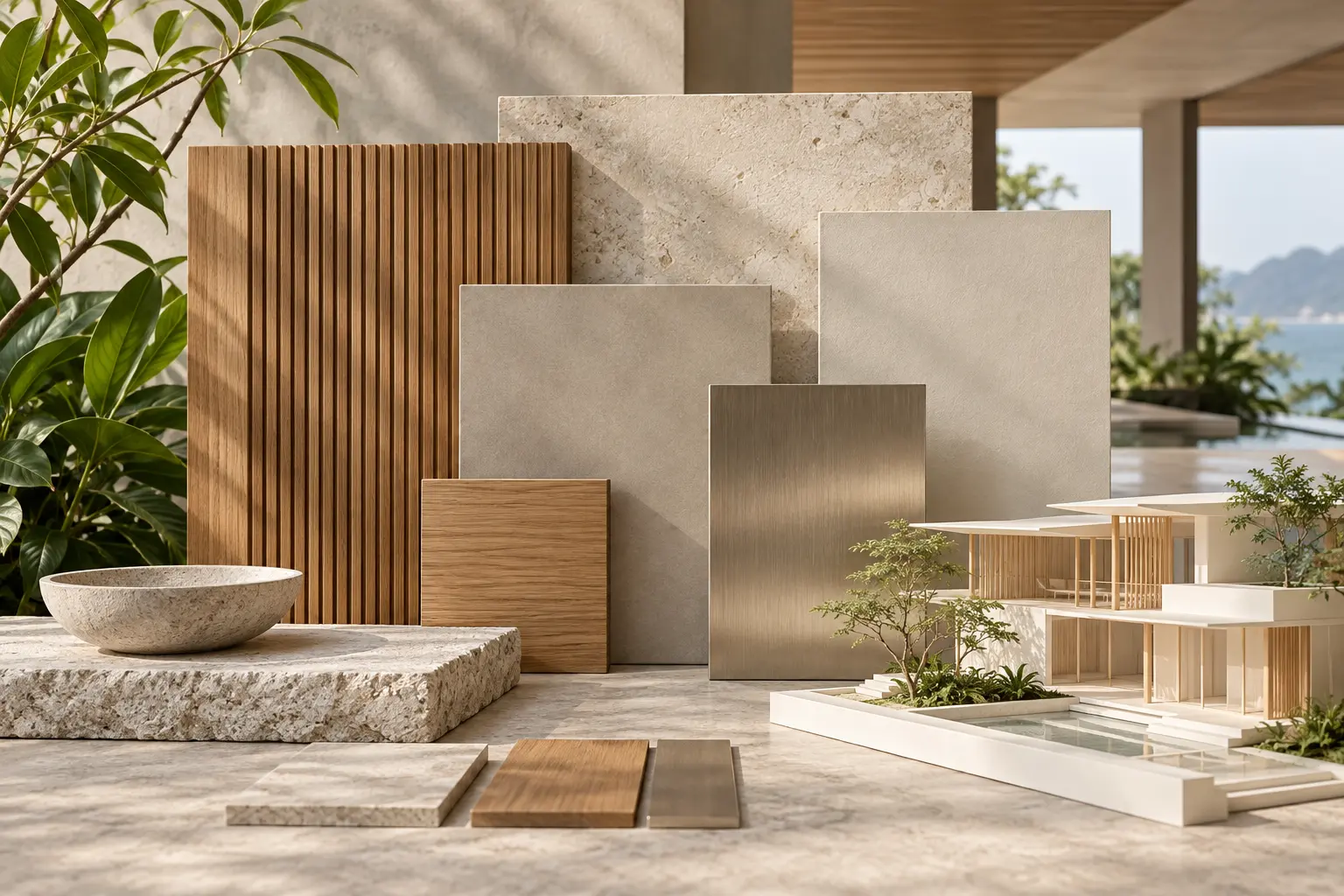
The material palette of a landed home is the coordinated set of surfaces that gives rooms and elevations their visual relationship. It is more useful than a collection of attractive samples. A good palette establishes what repeats, what changes and how those decisions support the architecture and the way the household lives.
A useful distinction between appearance and execution
BCA’s CONQUAS overview identifies internal and external finishes within its workmanship assessment approach. A palette serves a different purpose: it defines the intended visual relationships. Keep design approval and construction-quality checks connected without assuming that one replaces the other.
The material palette of a landed home needs a hierarchy
Choose the background first
Begin with the largest continuous surfaces, such as floors, walls and ceilings. These establish the setting for furniture and smaller details. If each large surface competes for attention, adding more distinctive materials may make the house feel unsettled. Agree which element should lead and which should remain quieter.
Then identify where a stronger material is useful. It might mark an entrance, a stair or a shared room rather than appear everywhere. The point is not to impose a universal limit on material numbers. It is to give each selection a role that can be explained through the plan and the experience of moving through the house.
Describe relationships rather than fashionable labels
Words such as warm, minimal or natural can mean different things to different people. Pair them with actual samples and a description of the desired contrast. Is the timber intended to stand apart from the floor, or sit close to it in tone? Is the metal a visible accent or a quiet supporting edge?
The broader materials and finishes guide connects these visual choices to exposure and maintenance. Keep that practical brief beside the palette. A material should not survive selection solely because it photographs well when its cleaning requirements or expected wear conflict with the household’s preferences.
Compare samples in meaningful conditions
Review samples together rather than approving each one separately. The same surface can appear different beside a warmer timber or a cooler wall finish. Use a sufficiently large sample to understand variation and ask whether the supplied material is expected to differ from the reference piece.
Look at the samples under daylight and the proposed artificial lighting. If a finish will be used outdoors, assess it in an appropriate external setting as well. The aim is not to predict every possible appearance, but to avoid approving a relationship seen only beneath unfamiliar showroom lighting.
Use one corner as a palette test
Choose a representative corner where the floor, wall, door and a piece of cabinetry meet. Assemble the relevant samples together and review the intended joint lines. This concentrated test can be more useful than a large board of unrelated products because it shows how the palette will actually be experienced. If the corner feels unresolved, adjust the relationship before repeating the same combination across several rooms in the house.
Develop the palette through room sequences
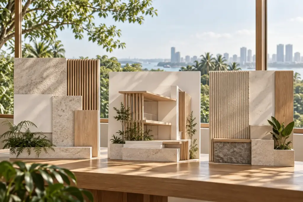
Walk from the entrance to shared rooms and then to private spaces. Decide which surfaces continue and where a deliberate transition occurs. A change can help identify a quieter zone, but an unexplained succession of finishes may make the house feel fragmented. Use the plan to explain the reason for each transition.
Review doorways and stairs carefully because they connect different views. A material that works within one room may create an awkward meeting at the next. Show the edges and sightlines together. This is especially useful where open doors reveal several rooms simultaneously or a stair connects contrasting floor finishes.
Coordinate the exterior and interior without forcing sameness
The facade and envelope expression guide addresses the external assembly. An interior palette can relate to it through tone, proportion or texture without using an identical product. Exposure and construction requirements may make a literal continuation inappropriate, even when visual continuity remains a useful design goal.
Where a material crosses a threshold, ask how the detail changes. Surface treatment, joints and installation may need to respond to different conditions. Record the distinction clearly so a visual reference does not become an instruction to use the same specification in locations with different demands.
Turn the palette into an approval record
Use the interior-architecture integration approach to connect samples with cabinetry, doors, lighting and fittings. Identify who approves each selection and when the decision is needed. Late changes can affect several packages, particularly when thickness, edge profiles or dimensions differ from the original assumption.
Create a simple schedule with the product, finish, location and sample reference. Include any unresolved item and the person responsible for closing it. Bring that schedule and the physical samples to Joya so the palette develops into a coordinated set of decisions rather than remaining a mood board that different suppliers interpret independently.
Frequently Asked Questions
How many materials should a home palette contain?
There is no universal number. What matters is whether each material has a clear role and relates coherently to the others. Start with the main background surfaces, then add accents where they support the architecture. Review the whole sequence of rooms rather than counting samples in isolation.
Should all timber finishes match exactly?
Not always. Different timber tones can work together when their relationship is deliberate. Compare actual samples under relevant lighting and decide whether the intended effect is continuity or contrast. Avoid relying on product names alone, since similar descriptions may refer to noticeably different colours or surface treatments.
Can an online mood board replace physical samples?
It is useful for communicating direction, but it cannot reliably show texture, scale or the exact relationship between products. Use physical samples for final decisions and request larger mockups where needed. Record the approved selection so the eventual order is tied to an identifiable product and finish.
When should the material palette be finalised?
Develop it early enough to inform the architecture, then resolve product decisions before the relevant procurement and construction deadlines. Some choices depend on detailed coordination. Agree a decision schedule with the team so unresolved samples do not force rushed substitutions or changes after adjoining work has already been completed.