
Architectural Process Guides
How Material Choices Shape a Home’s Character


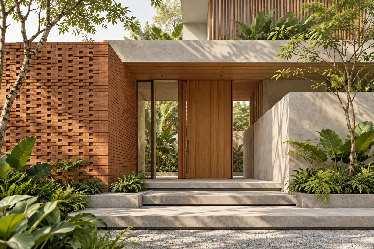
How material choices shape a home’s character depends on their scale, placement and relationship to light. Timber does not automatically make a house warm, and concrete does not automatically make it austere. The same material can feel very different when its proportions, surface treatment and surrounding elements change.
Appearance and workmanship are separate questions
BCA’s Quality Mark description excludes aesthetic preference from its workmanship assessment. That is a useful distinction for homeowners: the desired character needs a design discussion of its own. Construction-quality checks then help assess whether the agreed details have been executed appropriately.
How material choices shape a home’s character through scale
Look at the whole surface
A richly textured sample can be appealing in the hand but dominant across a large wall. Before approving it, review how much of the material will be visible and from which positions. The entrance experience may differ from the view across the street or from a room looking back toward the facade.
Consider the rhythm of joints and modules. A small repeated unit can create a fine-grained surface, while larger panels may produce a quieter reading. Neither is inherently better. Ask whether the scale supports the building’s proportions and whether the selected layout can be maintained around openings and corners.
Give the eye a place to rest
If every surface has a strong texture, the intended focal point may disappear. Decide which material should be noticed first and which should provide a calm background. A restrained wall can make a timber door feel more significant, just as a simple floor can allow a carefully designed stair to lead the room.
Use the facade and envelope guide to connect this visual hierarchy to the actual building assembly. Character should emerge from a coherent arrangement of form, openings and surfaces. Adding a distinctive cladding to an unresolved elevation rarely answers the underlying questions of proportion or the needs of the rooms behind it.
Let light reveal the surface honestly
Review texture under the light the surface will receive. Grazing light can make joints or irregularities more visible, while a shaded surface may read more quietly. Discuss the intended effect with the designer and avoid approving a finish solely from a brightly lit showroom panel that has little in common with its final location.
Artificial lighting also changes the experience. A feature wall may need a coordinated lighting arrangement, but the material should still make sense when that lighting is off. Ask to see ordinary daytime and evening conditions rather than a single dramatic presentation that depends on carefully controlled illumination.
Describe a reference precisely
When sharing a reference image, identify the quality you want to retain: a quiet colour relationship, a tactile entrance or a fine rhythm of joints. Avoid treating the entire image as a specification. Its light, camera position and surroundings may be unlike your project. A precise description gives the designer room to achieve the intended character through materials and details that suit the actual house rather than copying an unrelated facade.
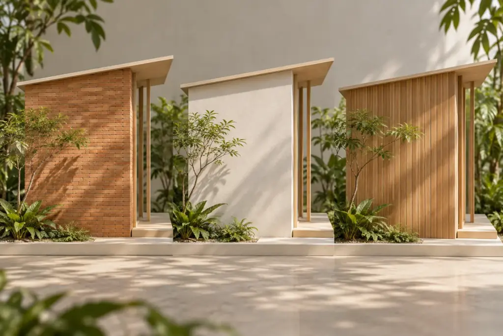
Connect tactile choices to everyday contact
The surfaces people touch at an entrance, stair or dining area carry a different kind of character from distant facade elements. Consider edges, handles and the feel of the finish as well as colour. A material chosen for visual strength may need a more refined detail where hands or bare feet regularly meet it.
Describe the household’s expectations about wear. Some people welcome visible variation and gradual change; others prefer a more consistent appearance. Ask for realistic product information and examples relevant to the intended exposure. Do not promise that weathering will become an attractive patina without understanding the material and its maintenance conditions.
Make transitions part of the expression
A material becomes more convincing when its beginning and end are deliberate. Review how it meets a ceiling, turns a corner or stops beside a window. An awkward edge can undermine an otherwise well-chosen surface. Ask the team to resolve the visible junctions before procurement fixes the product dimensions.
The facade screening systems guide illustrates how repeated elements can influence both appearance and use. The same principle applies elsewhere: an expressive detail should still permit operation, cleaning and repair. A visually delicate component needs a plausible support arrangement rather than relying on the apparent weightlessness of a rendering.
Keep the design intent clear during substitutions
When a product changes, compare more than its colour. Texture, module size, edge profile and reflectivity can alter the character of the whole assembly. Request a coordinated review before accepting a substitute as equivalent. A small price or availability change can otherwise create a noticeable difference at the most visible part of the house.
Bring physical samples, reference images and a short description of the intended feeling to Joya. Discuss what each reference actually contributes rather than copying its material list. The result should be a house whose character follows its proportions, use and setting, with selections that remain credible when built and lived in.
Frequently Asked Questions
Does using natural material guarantee a warmer interior?
No. The effect depends on tone, texture, proportion, lighting and the surrounding surfaces. A natural material can still feel visually cold or overly dominant in a particular arrangement. Compare samples within the intended palette and discuss the experience you want rather than relying on a broad material label.
Can different materials create a coherent home?
Yes, when their roles and relationships are deliberate. Decide what repeats, what provides contrast and where transitions occur. Review the sequence of rooms and external views together so variety supports the architecture instead of producing unrelated finishes that happen to look attractive when considered separately on a sample board.
Should weathering be treated as a design feature?
Only with realistic expectations about the selected product and exposure. Ask how its appearance may change and what maintenance is needed. Some households appreciate variation, while others do not. Make that preference explicit before approving a material on the assumption that all ageing will look attractive.
Why can a similar substitute change the design?
Products with similar colours may differ in texture, dimensions, edges or reflectivity. Those differences affect joints and the way light reads across a surface. Review the substitute in context and record approval before ordering, rather than assuming that a close colour match preserves the original architectural character.